Portfolio
With 12 years of experience, I’ve navigated diverse challenges — applying best practices that place people at the center.
Streamlining the User Workflow & Unlocking $3M in Cost Savings
Enterprise SaaS
Desktop Web
Product Design
B2B
Automotive
Company
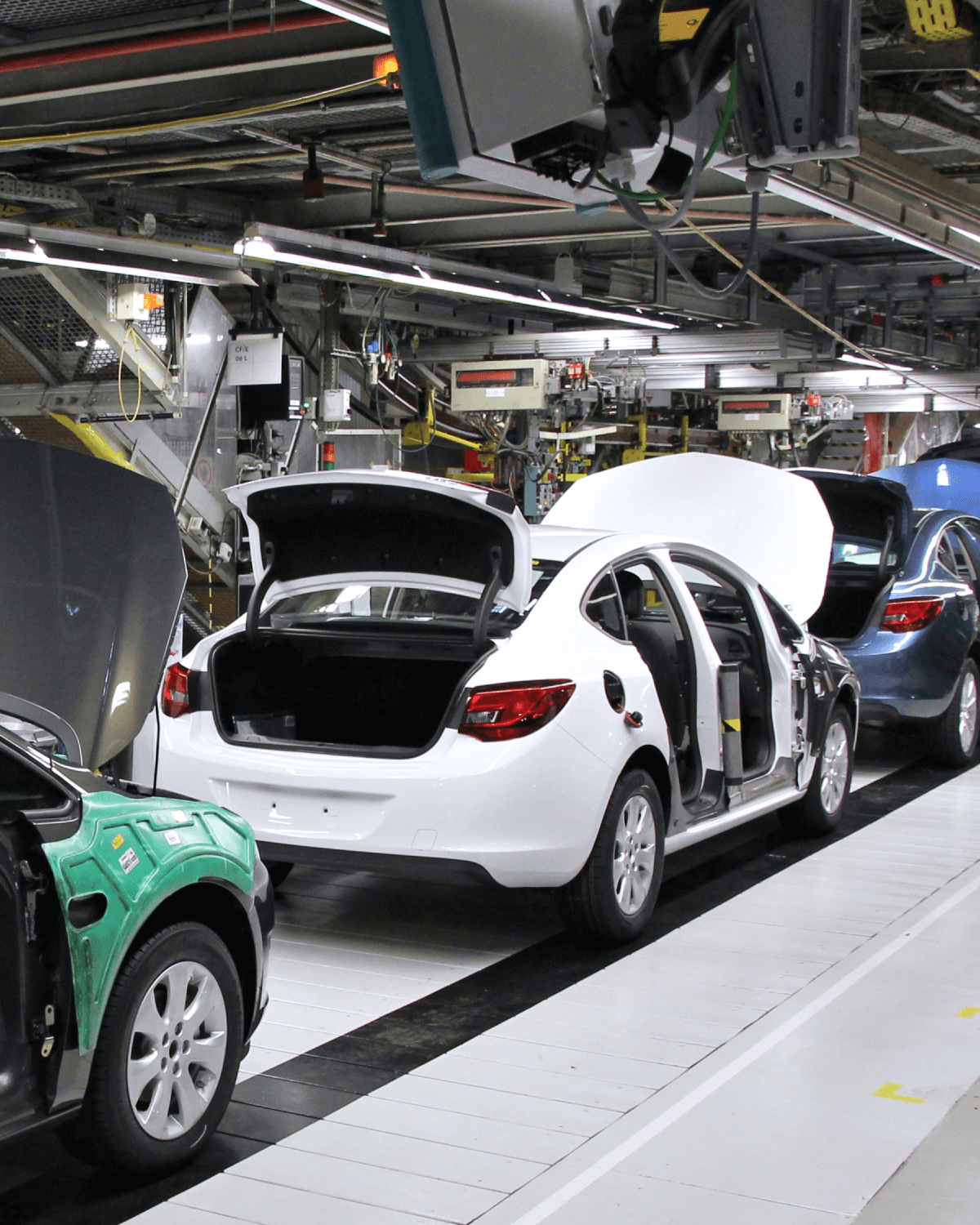
Cox Automotive is the world’s largest automotive services and technology provider with solutions for car shoppers, automakers, dealers, retailers, lenders and fleet owners.
Opportunity
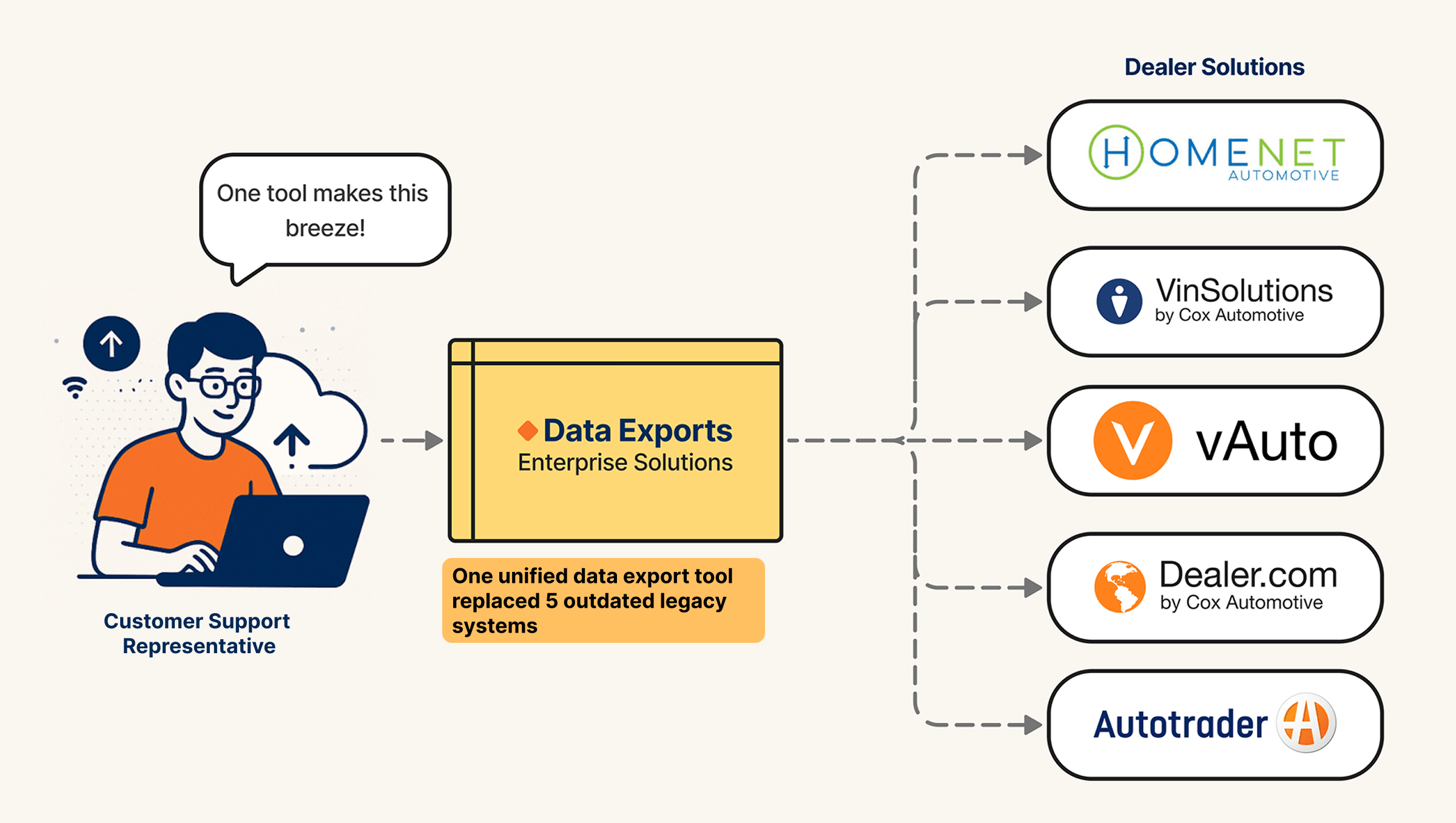
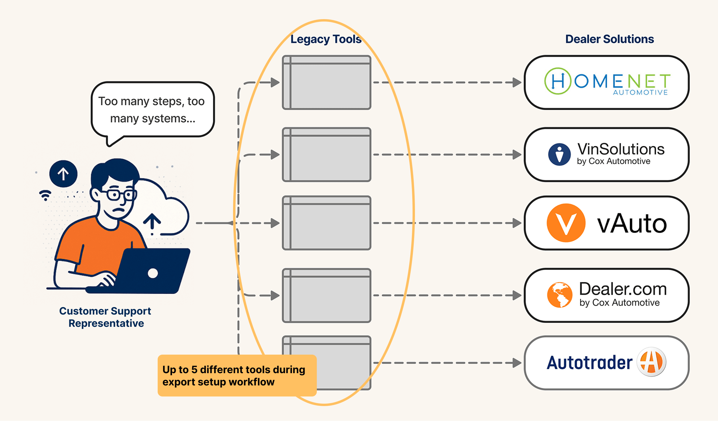
Customer Support Reps struggled with five clunky, outdated platform tools. I lead the design that streamlined their workflow into one, enabling $3M in cost-savings with $1.5M investment.
Team
• Product Designer (Me)
• Product Director
• 2 x Platform Architects
• 4 x Engineers
• Engineering Manager
My Role
• Research
• Workshops
• UI Design
• Prototype
• User Testing
Value Achieved
100%
Usability Success
Two usability tests ensured the new UX got the job done.
+40%
Workflow Efficiency
Replaced outdate tools , reducing 5hrs workflows to less than 1.
$3M
Cost-Savings
Retired redundant tools with yearly maintenance costs.
The Challenge
Customer service representatives were pressured to provide timely and accurate vehicle inventory data to dealers, but outdated legacy tools delayed critical business functions. To solve this, the business consolidated these tools into a single enterprise solution to cut costs and improve efficiency.
The "How"
Interviews → Problem Definition → Solution Ideation → Prototype & Test → Deliver
Discover Research
To understand the business objective and user needs, I conducted stakeholder and user interviews. This uncovered two unexpected challenges that we would need to overcome.
User Adoption Hesitancy
Users (customer support reps) worried that learning a new tool and workflow would require more effort to set up exports and risk their contractual service level agreements (SLAs).
Disjointed Experience
To speed up delivery and reduce risk. The new solution would be based on one of the existing tools, adding functionality with new design system screens. Requiring users to transition between completely different interface designs.
Create a streamlined vehicle data export tool that users embrace?
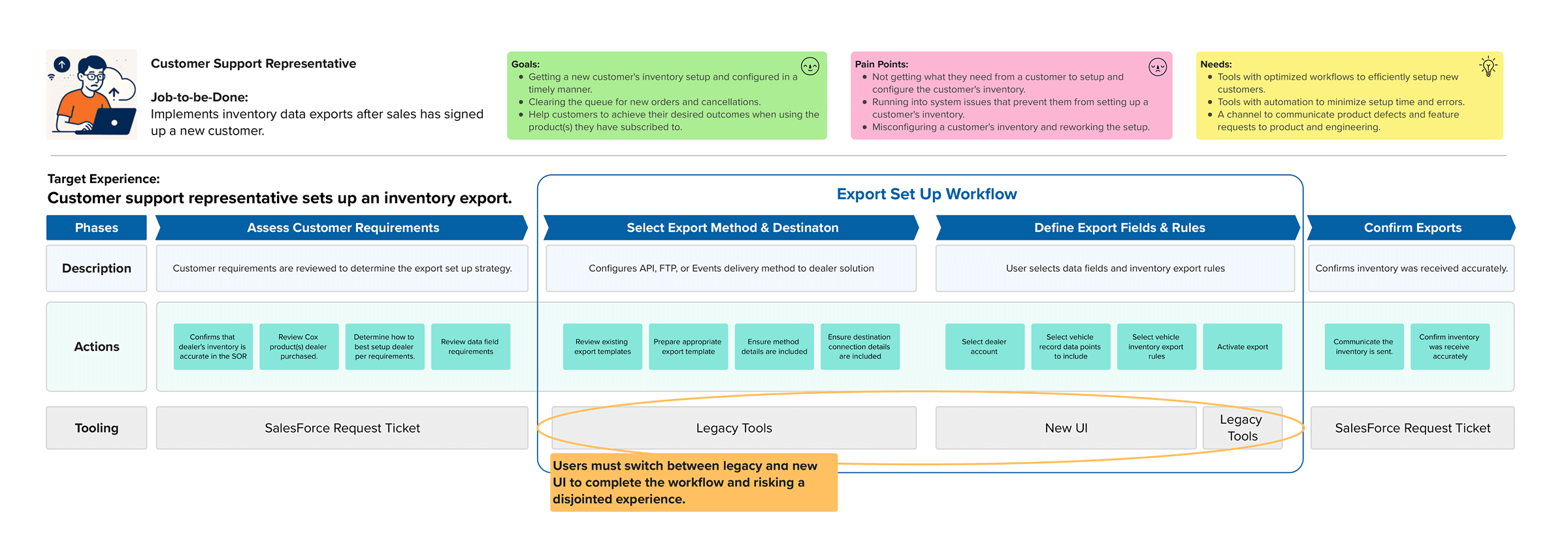
Mapping the Workflow
I invited customer support reps to map the current data export workflow because it helped them see that although the tools were changing the steps remain the same.
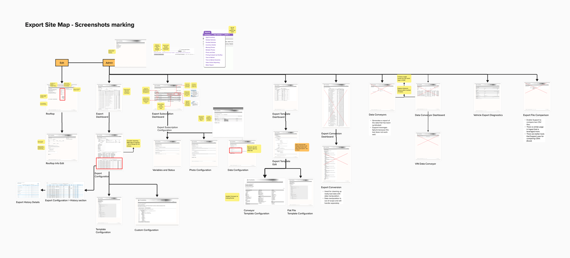
Mapping the Existing System
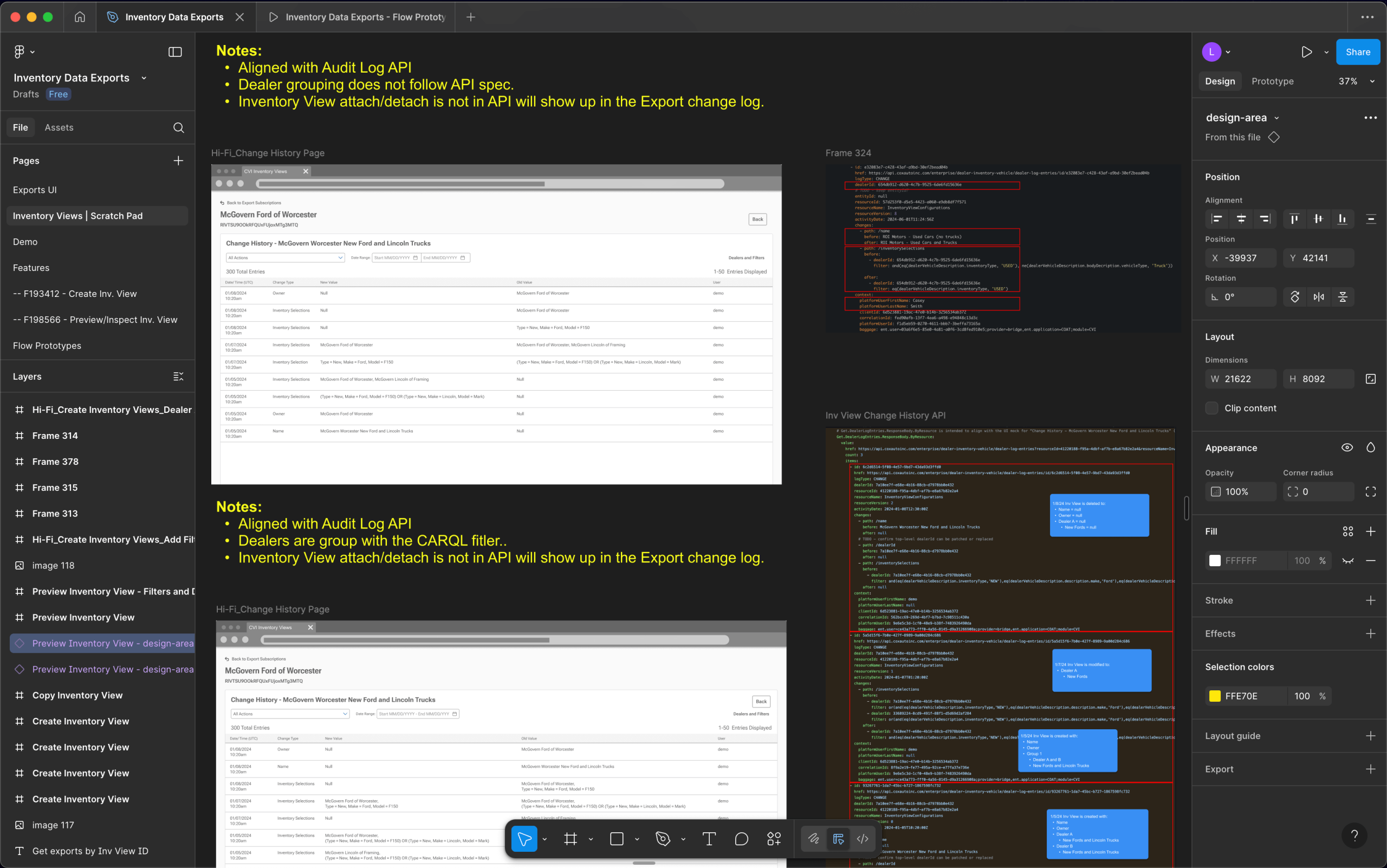
I worked with product and engineering to strip the legacy system to its core functionality in order to create a strong foundation for merging the new UI.
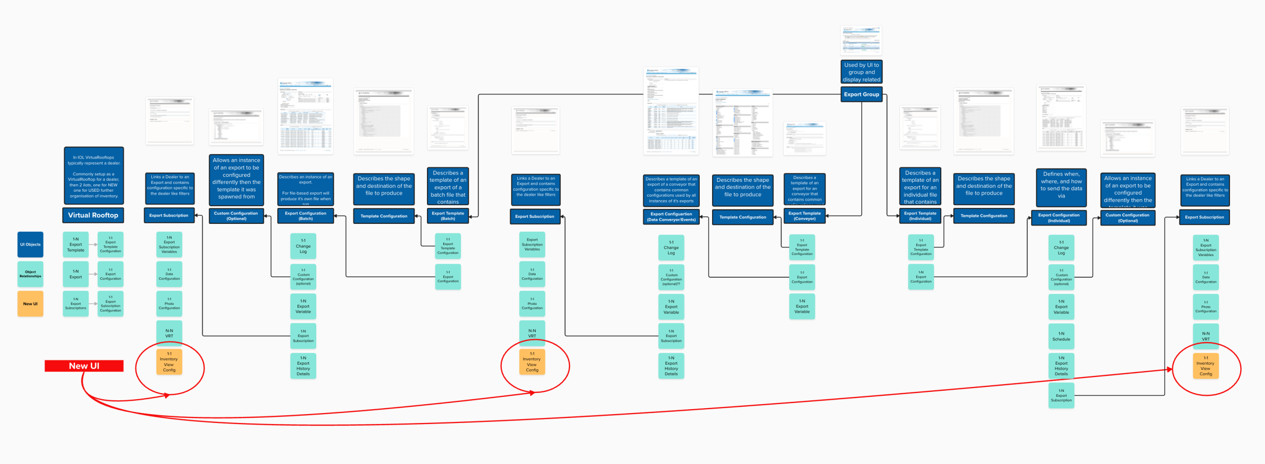
The Legacy and New UI Relationships
We outline how the new UI elements relate to the existing legacy tools. This minimized creating a disjointed experience by ensuring the new UI fits into the existing experience with minimal disruption.
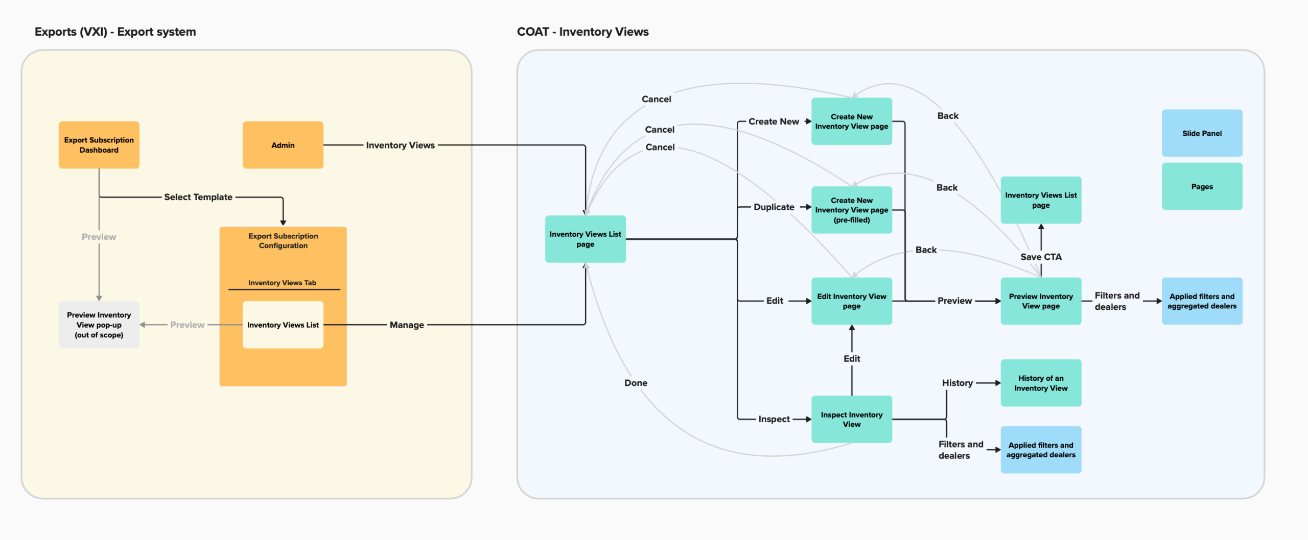
The User Flow
I created userflow to highlight how it prevented a disjointed experience by giving users the flexibility to easily navigate between the new legacy and new UI screens.
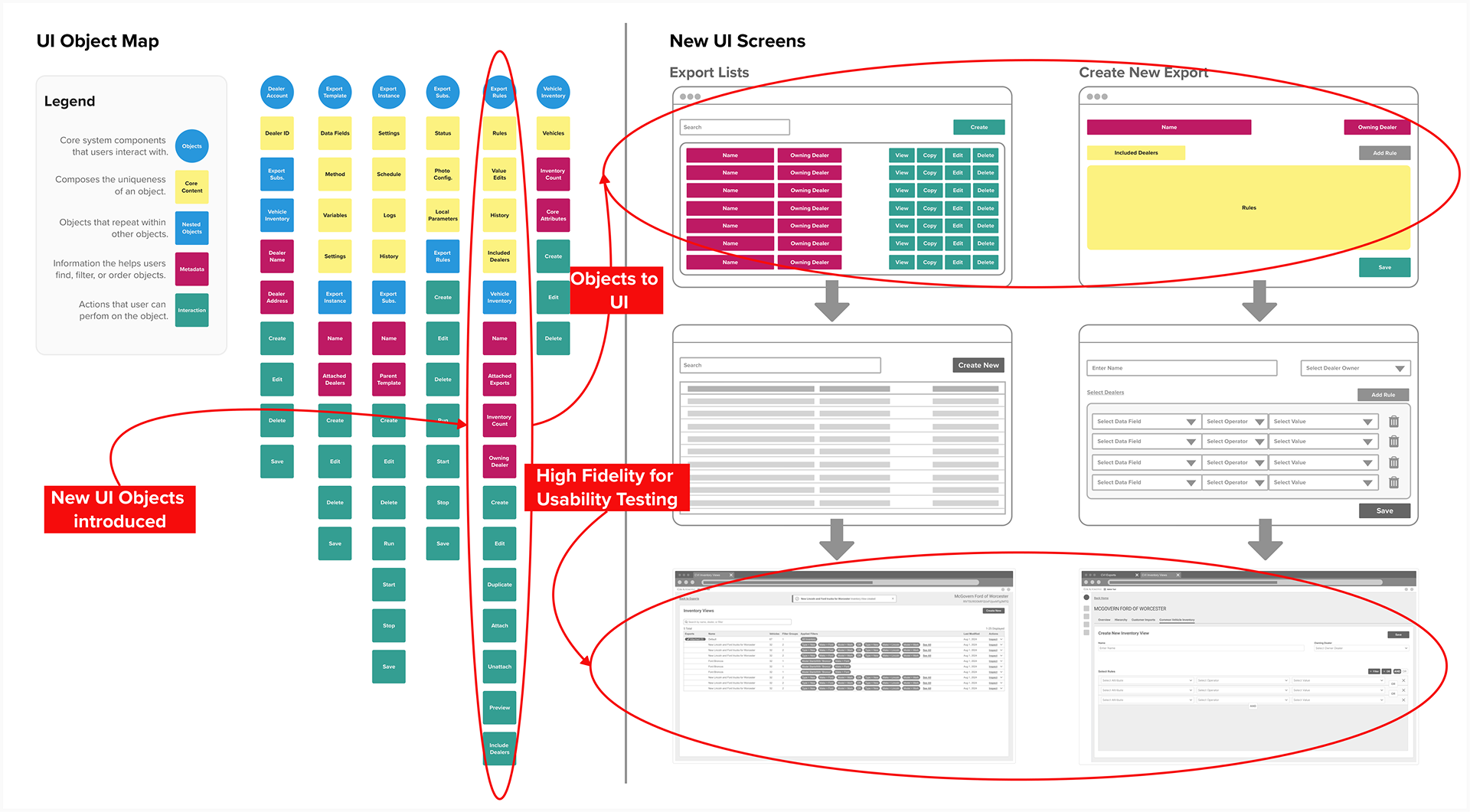
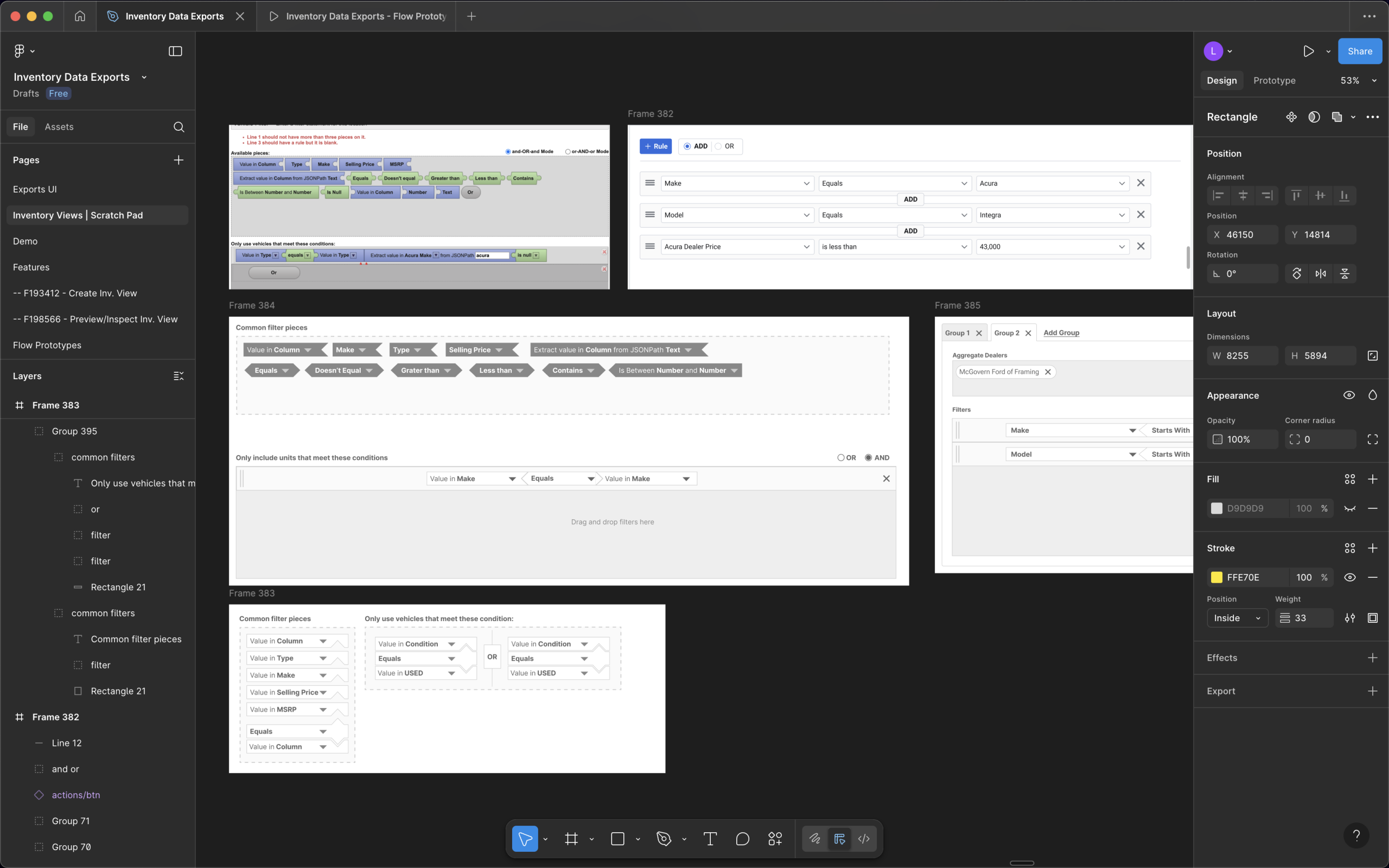
UI Object Mapping
I facilitated a working session with my team to list the new core UI elements we were introducing in order to account for their content, actions, relationships, and attributes.
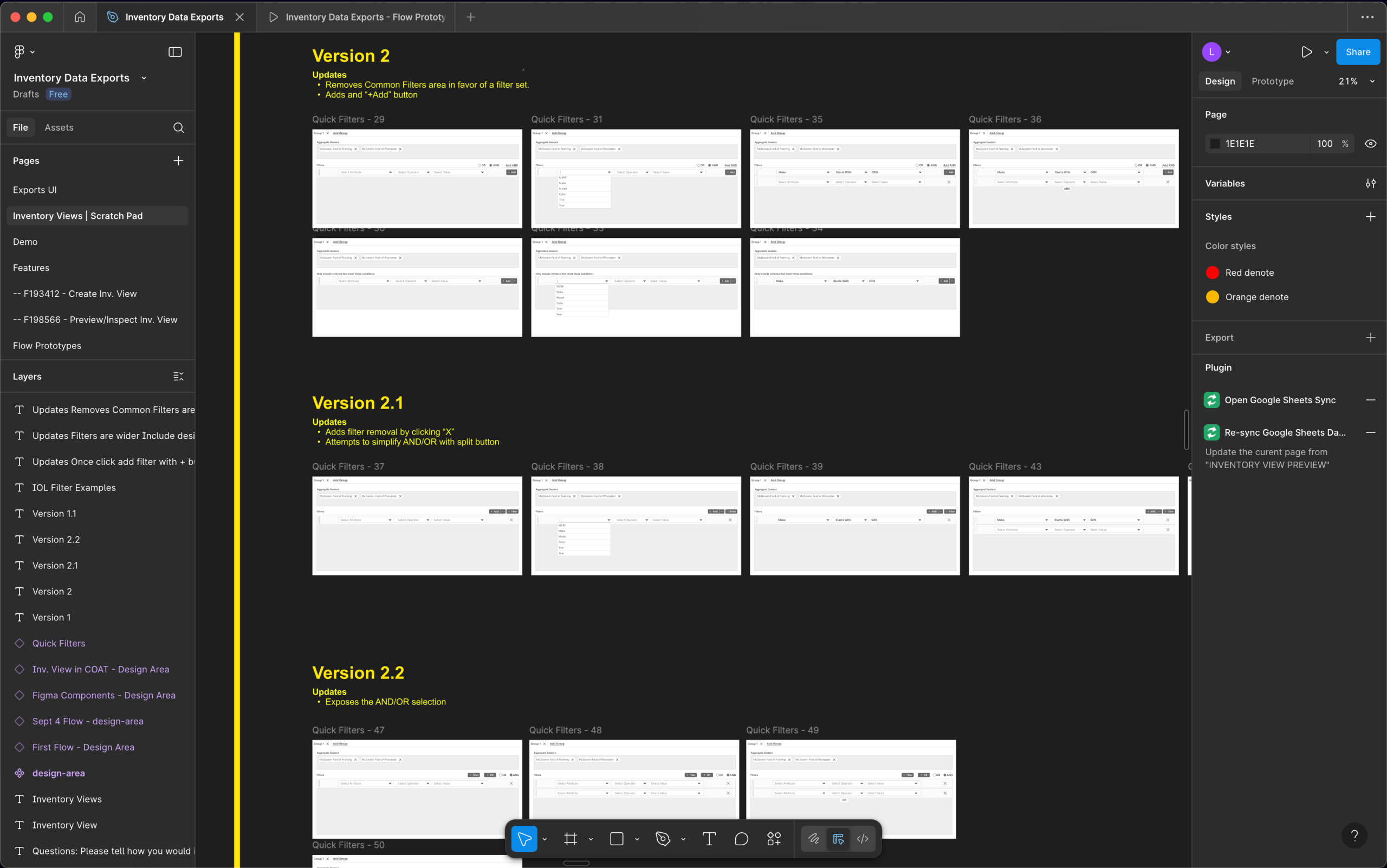
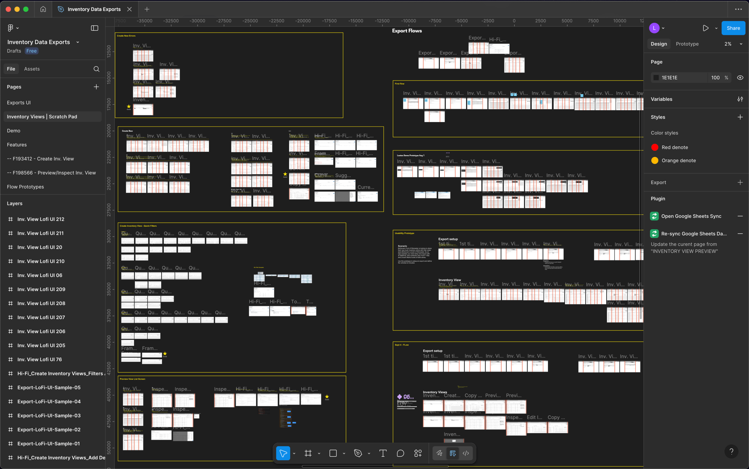
Design Iterations
I designed the experience to follow the workflow users were familiar with and user interface that aligned with their mental model.
Prototyping, Not Just for Testing
By prototyping early, we de-risked the process by creating engineering alignment, attaining leadership buy-in, and testing the usability with users.
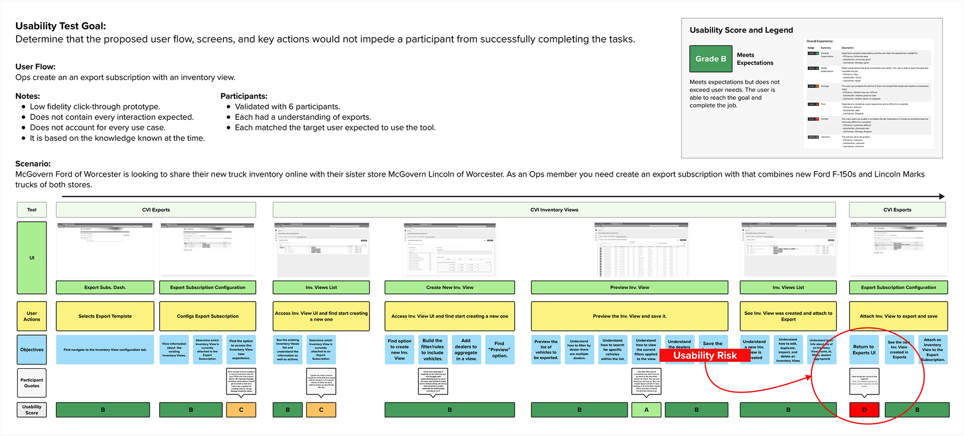
Identifying Risks from User Testing
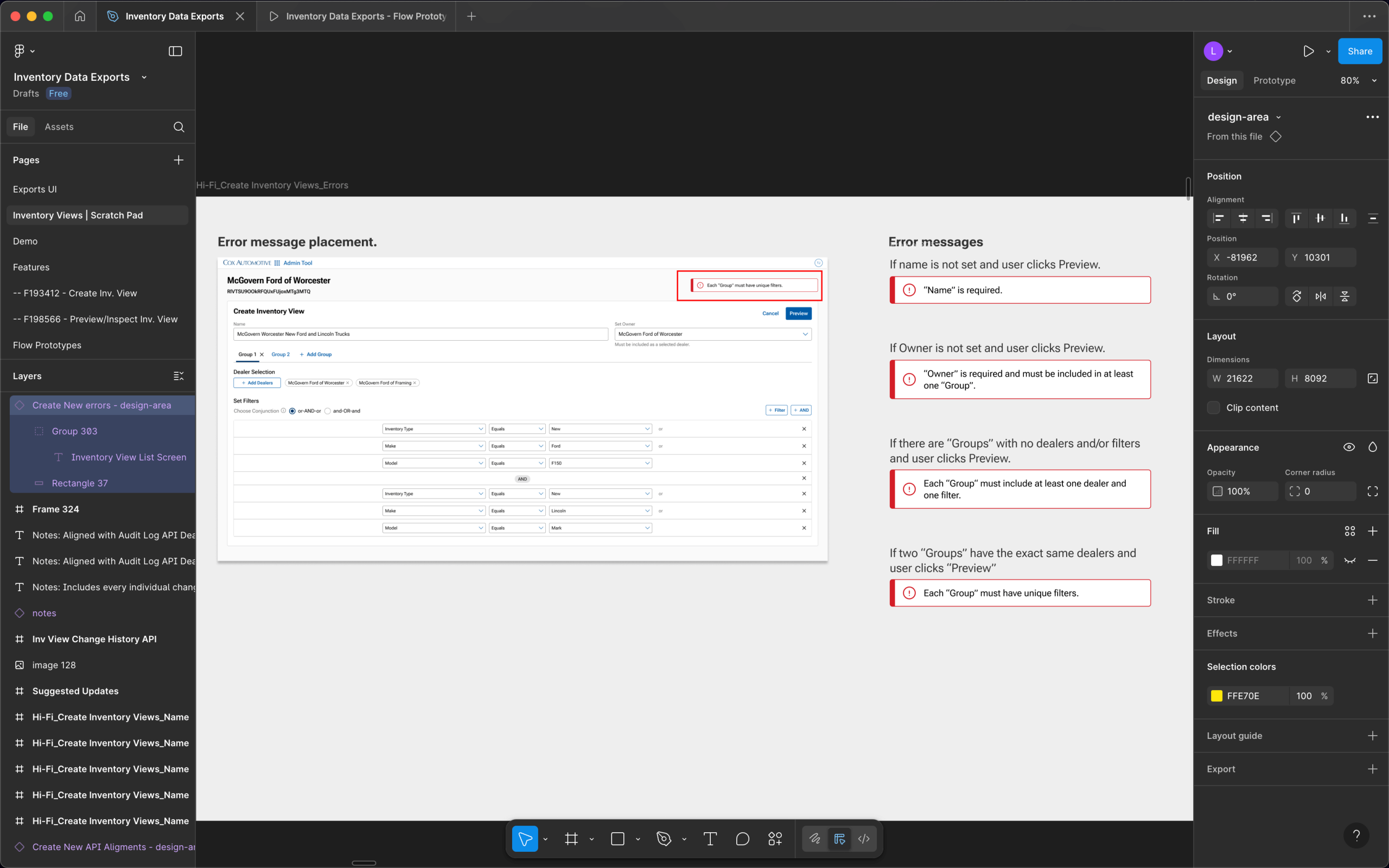
5 out 6 participants struggled when navigating back to the legacy UI from the new UI, it required them to switch browser tabs – it was an unexpected interaction that added time but more importantly risked closing a tab and breaking the workflow.
We called this out as a risk to the contractual SLAs because it would delay inventory delivery to dealer solutions. I used this data to request further investment in a solution. It was win for UX because the business not did want to invest in the legacy UI but the risk was too much.
Final Designs
After retesting the experience, 6 out 6 new participants successfully complete the workflow with no major issues. The new experience was finalized and moved to development. It was composed of legacy UI with an additional 3 new main UI screens.
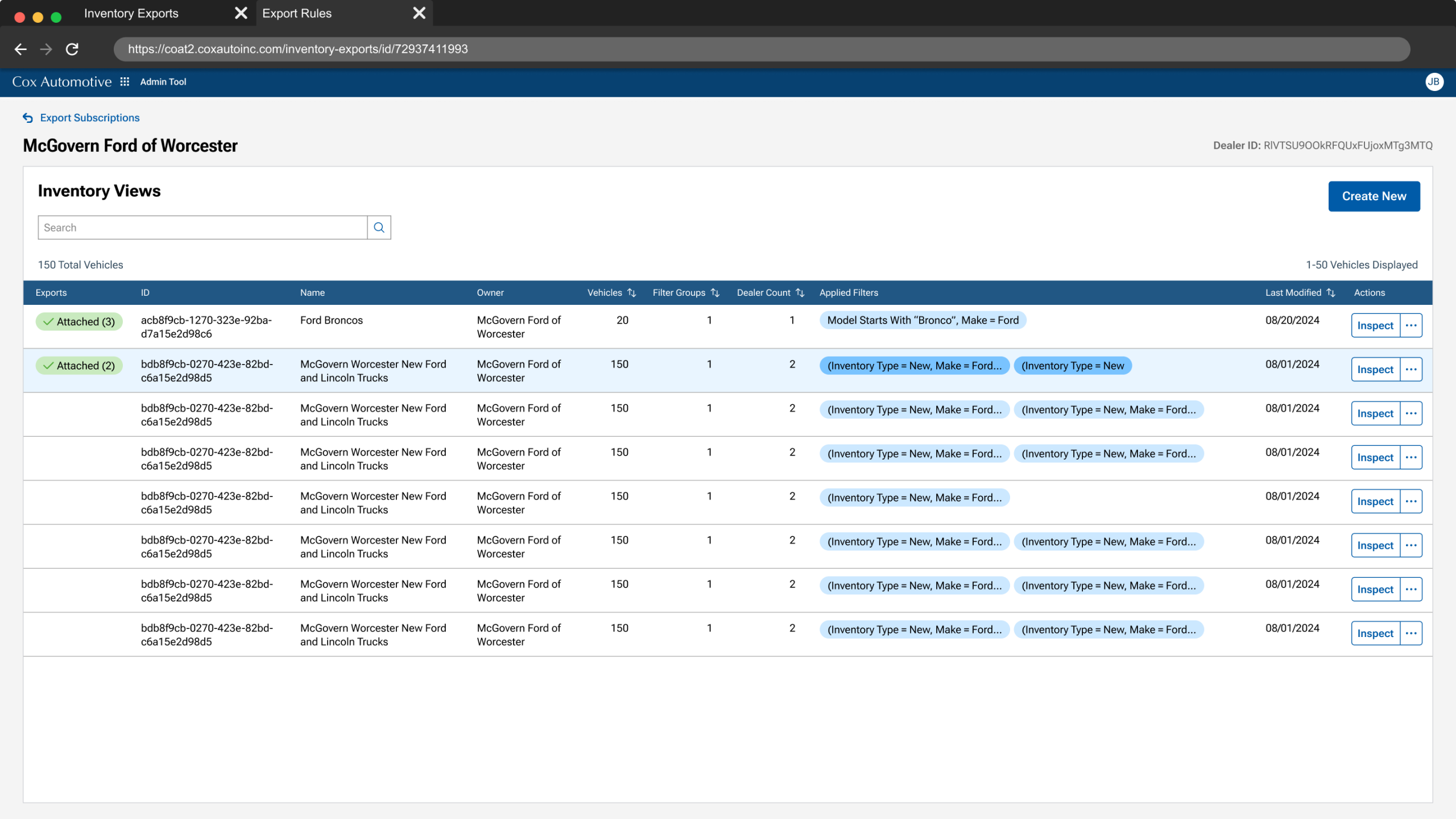
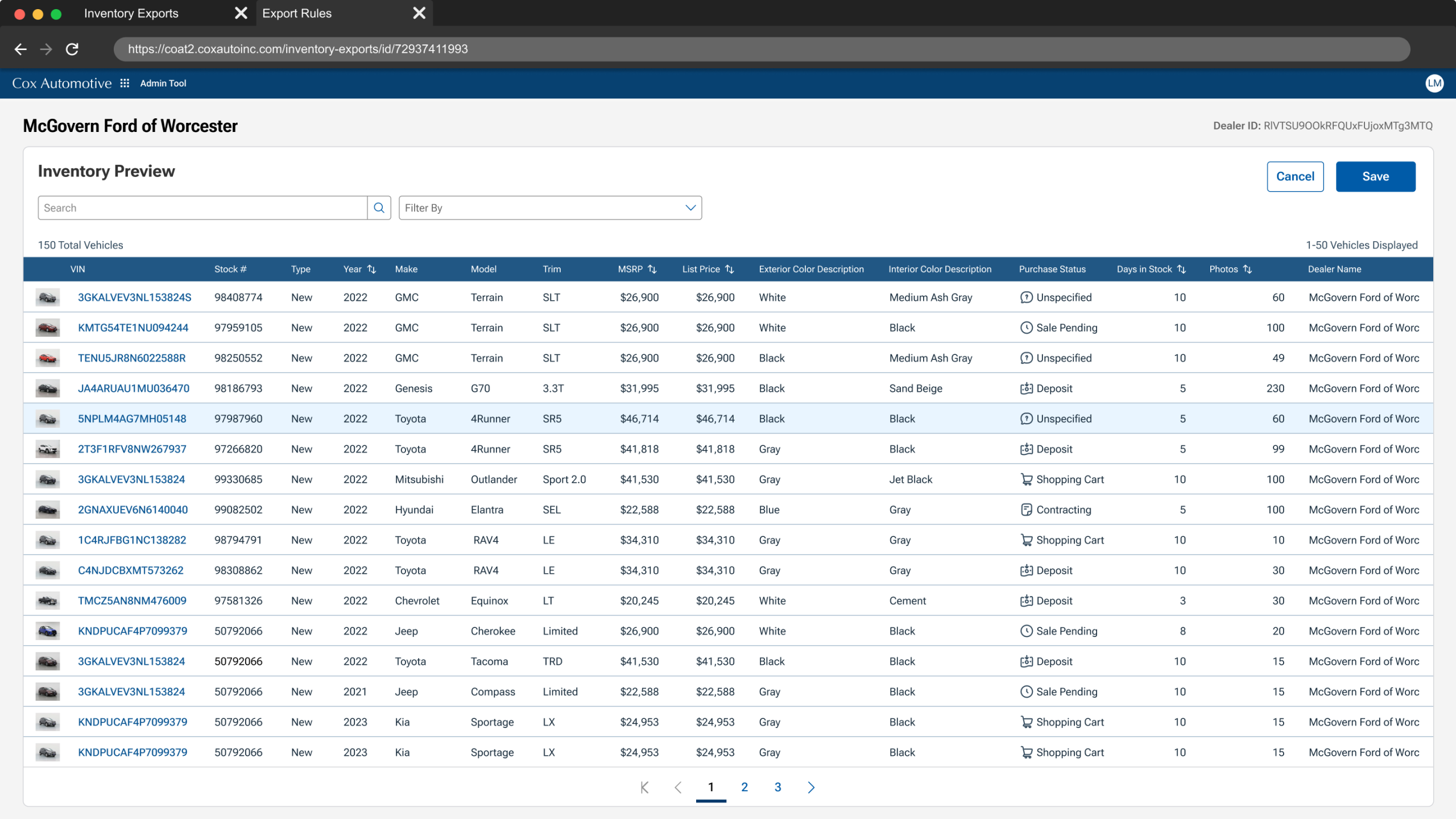
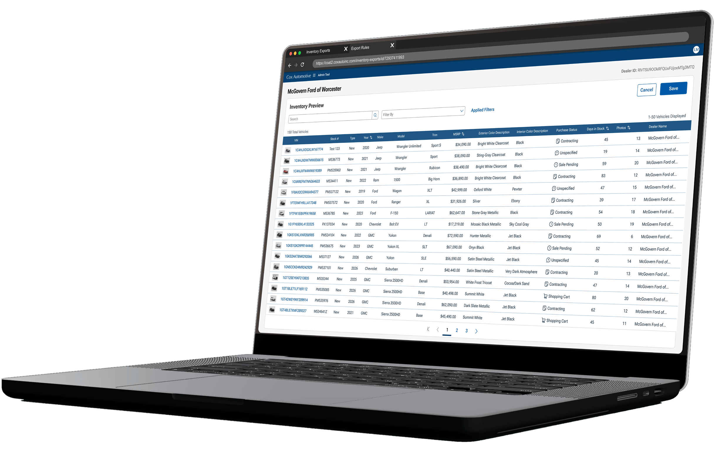
The Export List
Here, users inspect existing exports, which they can duplicate, reuse, edit, or create a new one.
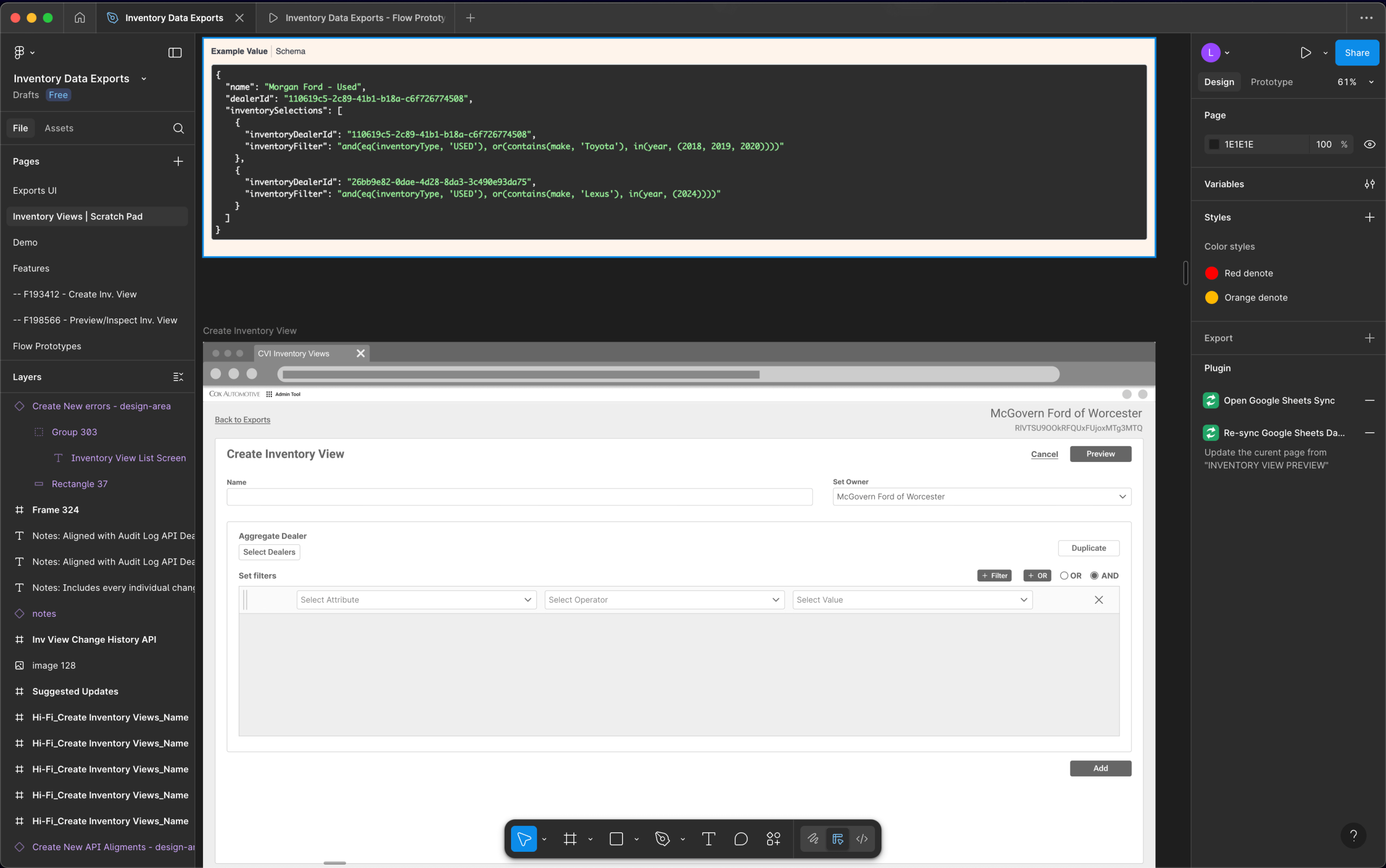
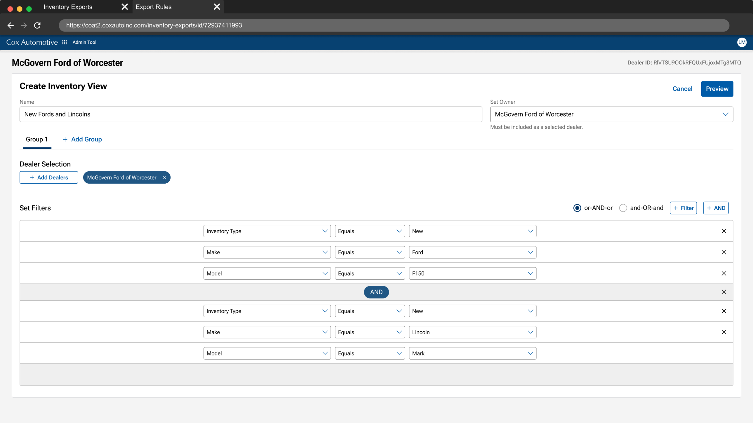
Exports Filter Builder
Filters are set according dealer requirements, they define what rules the vehicle inventory must meet prior to exporting to a dealer’s Cox Auto products.
By including users in the process and validating the experience we were able to resolve the initial challenges.
User Adoption Hesitancy
Involving users in the process overcame their initial hesitation and led to strong adoption of the new solution.
Disjointed Experience
We gained the confidence to proceed after validating that users could complete key tasks without any red flags.
Value Achieved
100%
Usability Success
Two usability tests ensured the new UX got the job done.
+40%
Workflow Efficiency
Replaced outdate tools , reducing 5hrs workflows to less than 1.
$3M
Cost-Savings
Retired redundant tools with yearly maintenance costs.

Drew Wilkison
Product Director
Luis showed me how he used the existing application features, combined with end user discovery, to not create a "lift & shift" new product, but one that accurately met the needs of the end user.
Takeaways
Collaborative Decision-Making
I facilitated workflow mapping and UI co-designing sessions, ensuring users and stakeholders had a shared understanding. This fostered buy-in and eased adoption hesitancy.
Strategic Risk Mitigation
I proactively addressed adoption challenges by involving users early, testing hybrid UI transitions, and iterating based on feedback—ensuring the solution met both business and user needs.
Advocacy for User Needs
When usability testing revealed risks (browser tab switching), I championed additional investment to refine the experience, protecting users from workflow disruptions.
