Portfolio
With 12 years of experience, I’ve navigated diverse challenges — applying best practices that place people at the center.
A Big Impactful Title Showing the I Added Value
Domain
Role
Platform
Company
Extra Mile are a social media app for cyclists. The app has a user base of 3 millions users.
Team
Extra Mile are a social media app for cyclists. The app has a user base of 3 millions users.
Skills & Role
Extra Mile are a social media app for cyclists. The app has a user base of 3 millions users.
Challenge Opportunity
Extra Mile are a social media app for cyclists. The app has a user base of 3 millions users.
Value Achieved
+33%
Operation Efficiency
Designed a quick view UI, 1 TSO may monitor 3 kiosks vs 1, freeing resources.
+30%
Passenger Verification Rate
A 3-step self-service experience, reduced verification time from 3 to 1 minute.
+99.98%
Verification Accuracy
Enabled a highly accurate & fast facial recognition vs human variability
Problem Context
Auto dealers were losing sales due to delayed (outdated) inventory data—all because Tier 3 specialists struggled with disparate and outdated legacy data export tools. Spending up to 5 hours setting up exports. The process was slow, error-prone, and fragmented, leaving dealers frustrated with longer issue resolution times.
The solution? Build an enterprise-wide tool. Easy right? Two problems. User adoption hesitancy and a disjointed experience.
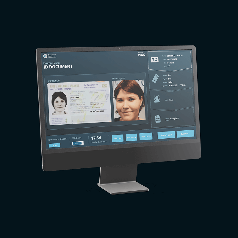
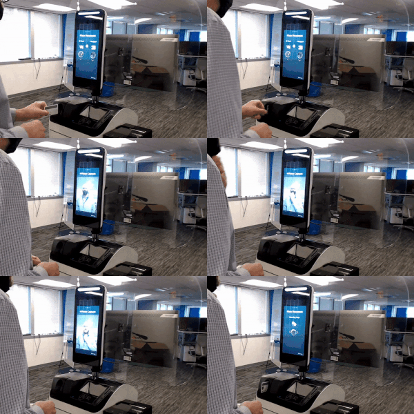
Design a kiosk user interface that enables passengers to self-verify so that TSOs are freed-up to focus on situational safety

The Strategy
1:1 Interviews → Workflow Mapping → Requirements → User Flows Ideation → Integration
The User Benefits of the Solution
Through a collaborative workflow mapping workshop, the team and I outlined the current and target process. Visualizing the verification process time reduction, thanks to near-instant highly accurate facial recognition and frees up TSOs with self-verification.
Constraints and Requirements
At this point, we were clear on who we are designing for and how they benefit from the solution. But before defining the screens, we needed to understand the current setup and constraints.
Existing Solution
Passenger verification solutions exist in the market. Our solution needed to fit within the user’s mental model. Else we risk creating friction, delays, and stress. The opposite of what users and the business needed.
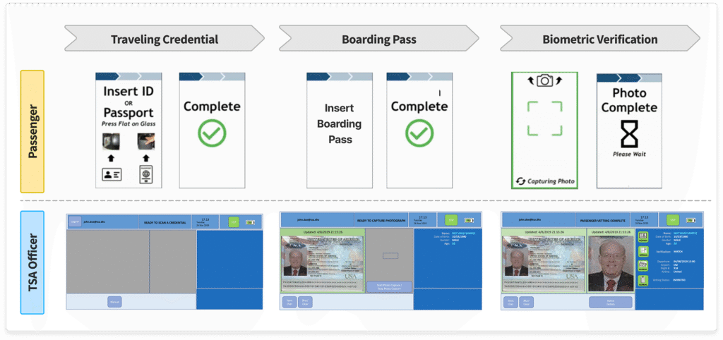
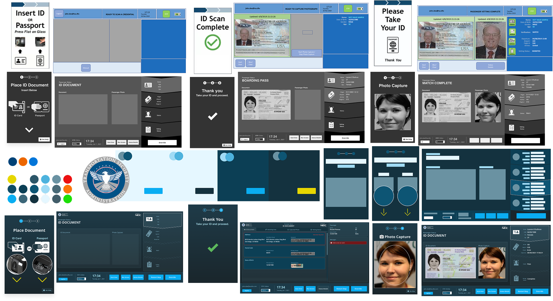
Baseline Screens
At the core, passenger flow was to follow a similar flow as existing solutions.
Scan Travel Credential
Scan Boarding Pass
Verify Passenger’s Face
Top Requirements
Keep it Simple
A 3 step intuitive passenger verification interface would enable a 1 minute verification process.
Maintain Familiarity
TSOs don’t need to spend time learning a new UI, we need to maintain a similar TSO screen layout and flow.
Quick View Mode
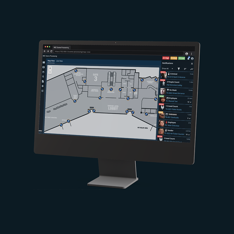
To minimize cognitive load and boost awareness, TSOs may monitor multiple kiosks hands-free.
Complex to Simple
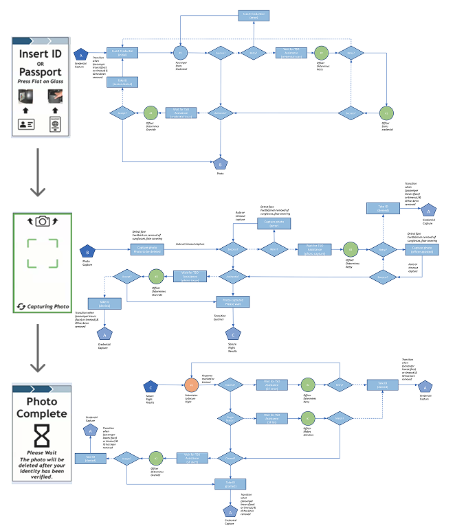
Achieving a simple 3 step passenger flow required continuous cross-function collaboration. Multiple user paths and possibilities needed to be accounted for. Each with various errors and notifications for the TSO to address.
The system orchestrated real-time validation across multiple layers: as passengers scanned their credentials, the TSO interface simultaneously cross-referenced data with STIP (for document authenticity) and SecureFlight (for threat assessment). Each validation failure triggered context-specific alerts—requiring dynamic UI logic to display precise failure reasons (e.g., document tampering vs. no-fly list match) without overwhelming operators.
Formulating the Interface Designs
Leveraging the baseline screens for the interface design, we were able to cycle through iterative design sprints. Designing, reviewing with the core team, and updating until attaining a collective 75+% level of confidence to start integration into the kiosk.
Quick View Mode
Finally, to permit TSOs to monitor multiple kiosks, I designed high-contrast and recognizable status indicator screens. At quick glance, notifying TSOs, when the passenger verification is passing, there’s an error, system is waiting, or TSO assistance is needed.
Value Achieved
+33%
Operation Efficiency
Designed a quick view UI, 1 TSO may monitor 3 kiosks vs 1, freeing resources.
+30%
Passenger Verification Rate
A 3-step self-service experience, reduced verification time from 3 to 1 minute.
+99.98%
Verification Accuracy
Enabled a highly accurate & fast facial recognition vs human variability
Drew Wilkison
Principal PM
Luis showed me how he used the existing application features, combined with end user discovery, to not create a "lift & shift" new product, but one that accurately met the needs of the end user.
Leadership
[I showed leadership on the project in these ways...]
[I showed leadership in my team in these ways... (mentorship/coaching)]
[I showed leadership to the client in these ways...]
Expertise
[I showed top craftsmanship in these ways... (UI/UX/UXR)]
[I showed top domain knowledge in these ways...]
[I showed top business skill in these ways...]
What didn't work?
Engineers flagged latency.
Risking passenger queue buildup. My wireframes assumed near-instant verification. This resulted in the introduction of additional status screens ("Verifying...") to manage wait-time expectations.
Non-english speakers struggled with wordy text instructions.
- Modified the passenger UI to use strong iconography with minimal text.
- Bring up the “Get Help” CTA after 30 seconds of no activity.
- While speed was praised, some requested more language options.
Key Takeaways
1Foundational research (even via SMEs/secondary data) was critical for understanding baseline experience.
2Using familiar UI elements (based on the existing solution) minimized passenger learning curves and TSO retraining.
3Frictionless UX enabled strategic automation freeing up human resources for higher-value tasks (e.g., threat detection) and improves accuracy.
4Aesthetic choices (e.g., status indicators) are instrumental in high-stakes environments where errors have serious consequences.
