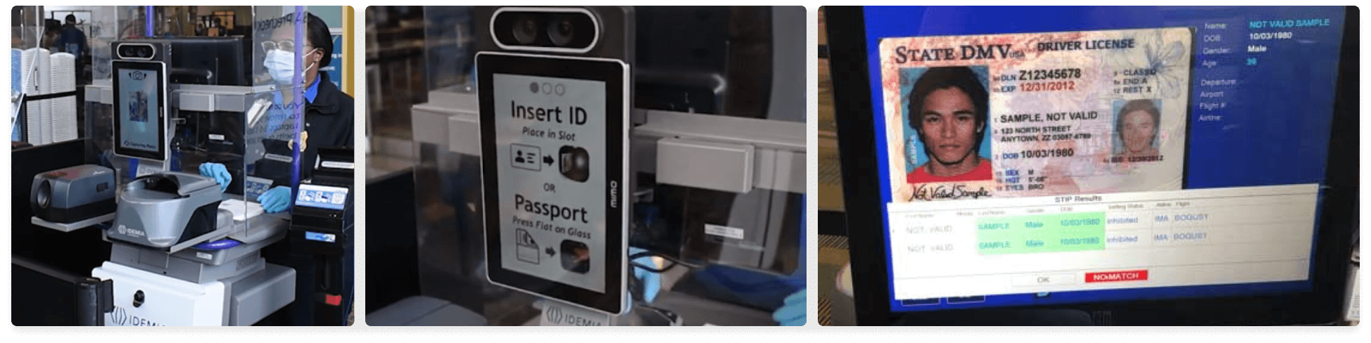
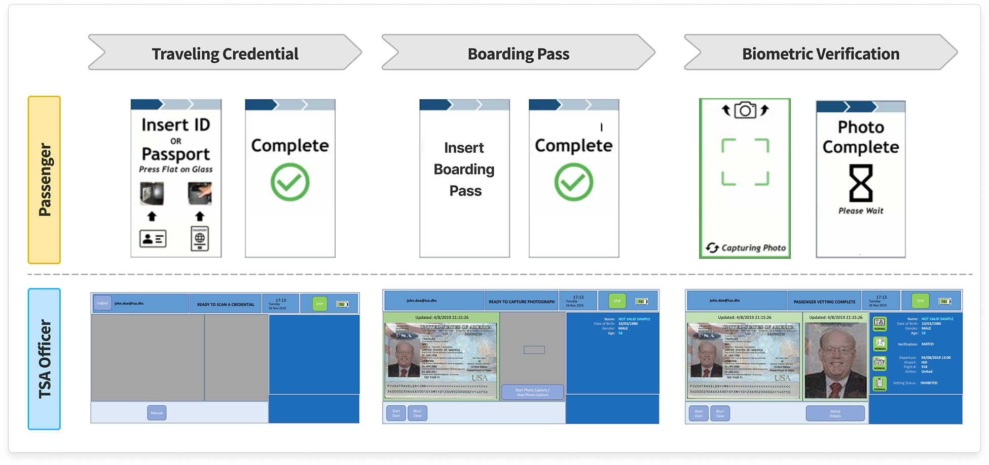
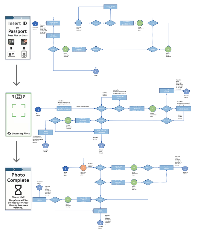
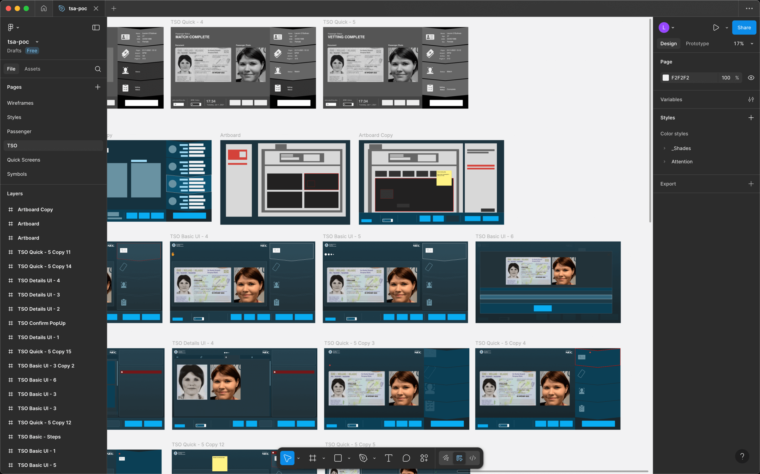
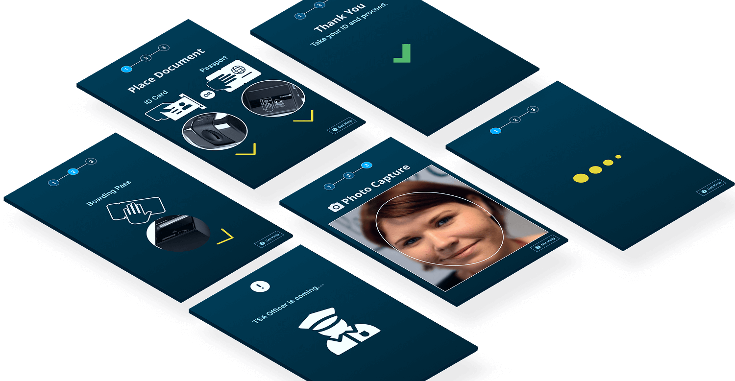
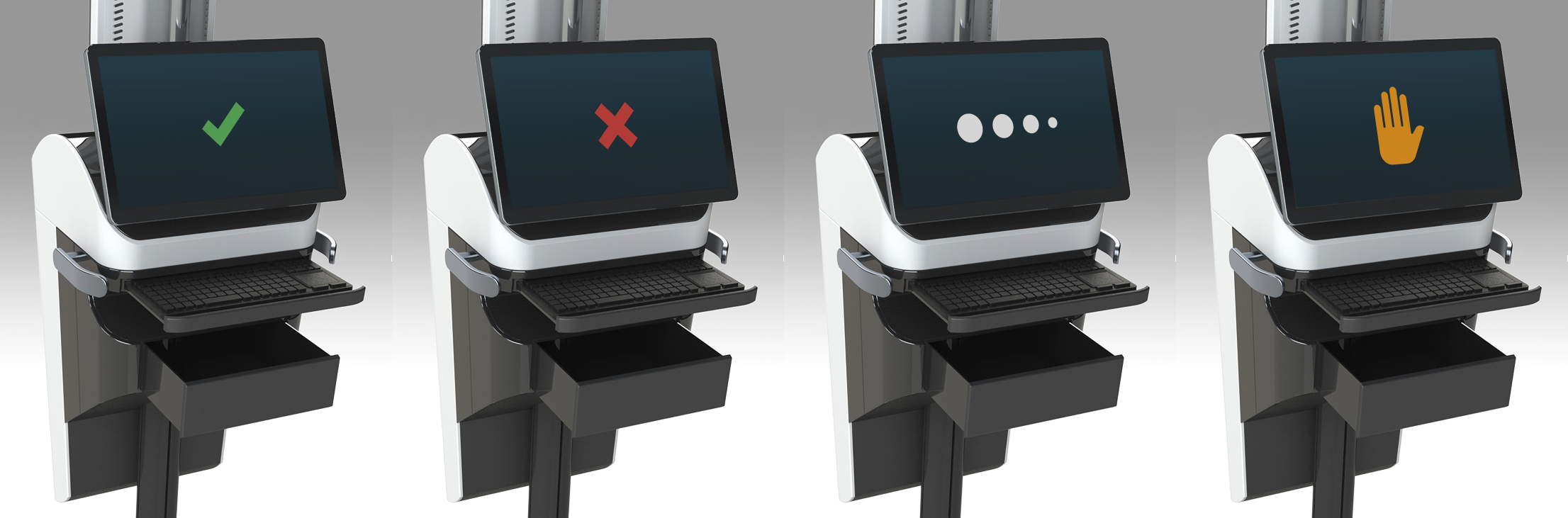
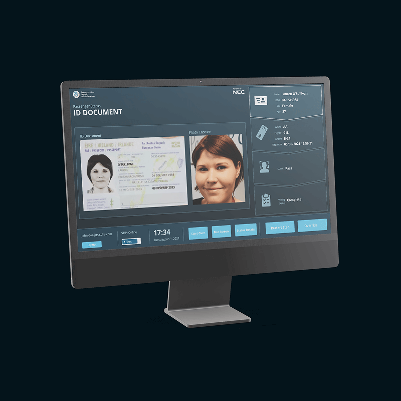
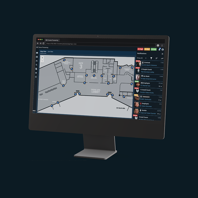
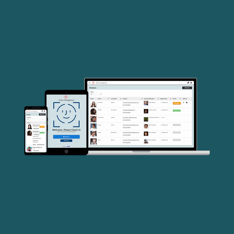
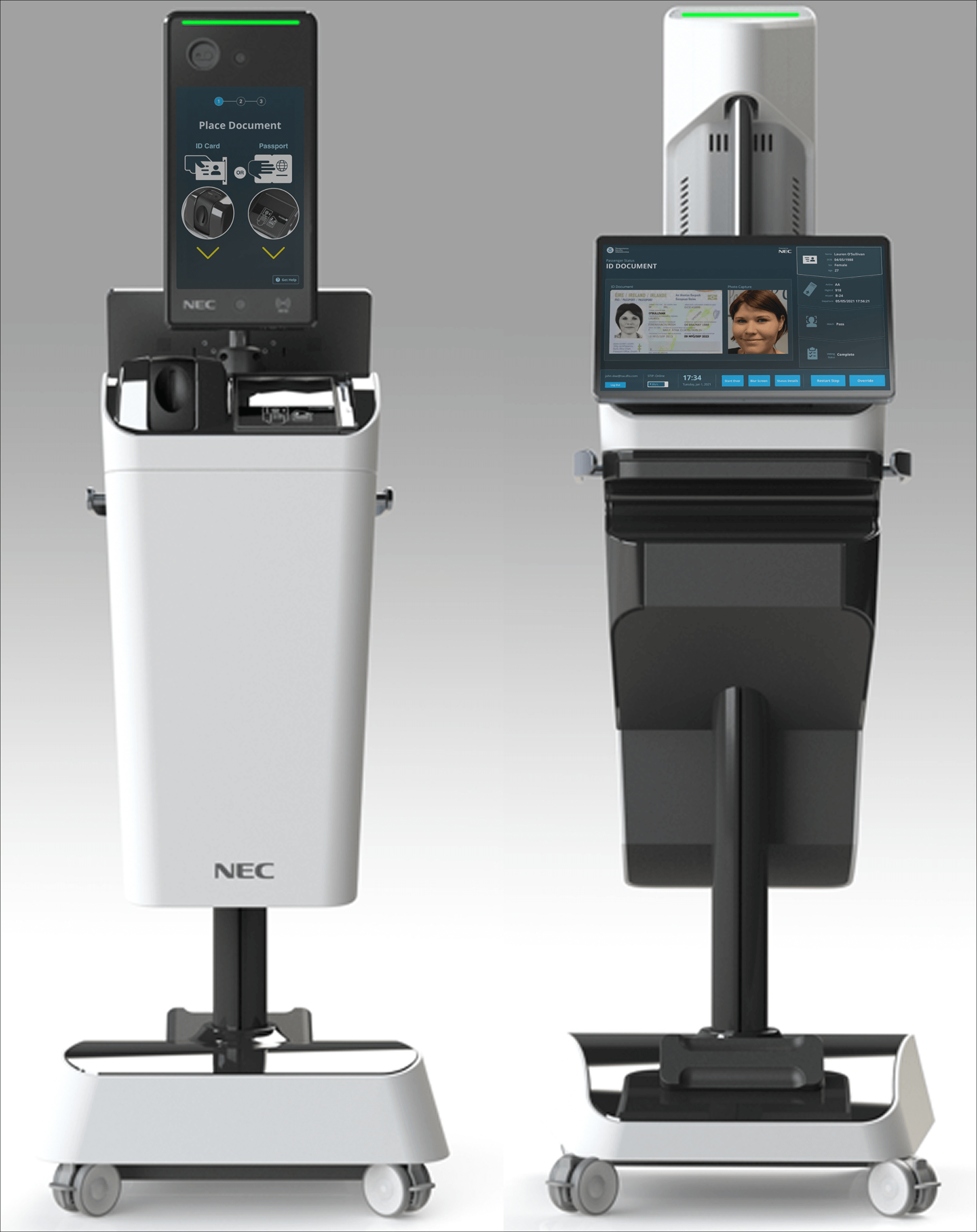
Background

Designing an Efficient TSA Security Kiosk Interface

Peak travel season pushes TSA officers (TSO*) to their limits, manually verifying thousands of documents while ensuring security. What if there was a way to ease this burden? Learn how I designed the interface for NEC’s self-verification mobile kiosk that streamlines the verification process, enhancing security, and freeing up TSA resources.

*TSOs: In addition to line management, TSOs screen passengers, baggage, and cargo at airports and other transportation hubs to prevent the introduction of prohibited items and potential threats.

Core Team:

> Product Manger
> Solution Architect
> Software Engineer
> UX Designer

Methods:

> User Personas
> Journey Mapping
> Wire-Framing
> UI Design

Duration:

6 Months

The Challenge

As the UX Designer on the team, I was challenged with designing the kiosk’s interface in a way that enabled passengers to self-verify. Therefore, freeing-up TSOs to focus on maintaining a safe and secure environment.

Research

Research was immensely supported by the collaboration with the Product Manager (travel industry SME). 

User Personas


Both passengers and TSOs are users and the beneficiaries of the solution. The TSO uses the kiosk to eliminate manual verification and benefits from reduced cognitive strain. While the passenger uses the kiosk to self-verify, resulting in faster lines and increased sense of safety (See Image A).

Image A - User personas brought user needs to the forefront of our experience decisions.

Current State Journey Map


We outlined the 3-minute verification process (See Image B), where TSOs manually verified up to 80 passengers in a 4hr shift. The repetitive nature of this task, especially during extended shifts and holidays, added cognitive strain and heightened security vulnerabilities.

Image B - Current state journey map depicts every micro task a TSO performs during verification.

Target State Journey Map


With a foundational understanding of the current experience, we produced a Journey Map (See Image C). Illustrating how the solution removes the need for TSOs to manually verify passenger identities, closing critical security gaps that come with human error.

Image C - This target state user journey depicts the removal of manual verification steps.
Framing The Problem

How might we design a kiosk user interface that enables passengers to self-verify so that TSOs are freed-up to focus on situational safety?

With deep user insights, we crafted a problem statement that zeroed in on the core design challenge—ensuring a solution that truly benefits the users.

Design Ideation

Constraints


The kiosk was designed by a 3rd party engineering firm with two separate screens, one for passengers and one for TSOs. The core design elements and user flow needed to be based the existing setup to keep interactions intuitive, avoiding slowdowns and reducing additional workload for TSOs. (See Image D & E)

Image D - Kiosk design & current user flow.
Image E - Photos of the current set up

User Flow


The user flow expanded on PMs guiding artifacts. This served as reference to ensure the interface design moved users forward in the process while covering error states. (See Image E)

Image E - User flow demonstrating the passenger verification steps and failure flows.

Wireframes


Wireframes facilitated communication with engineering and product. This was instrumental in discussion on functionality, interactions, and capturing any usability concerns (See Image F).

Image F - Low fidelity wireframes streamlined the UI iteration, letting us focus on the functionality and user flow before committing UI details.

Production Designs


The UI color scheme expanded on the TSA logo’s tints, tones, and shades to create high-contrasting colors for calls-to-actions, status messages, and step indications. (See Image G, H, and I).

Image G - The style of UI aimed to convey calmness, trust, and reliability.
Image H - Passenger self-verification interface designs.
Image I - TSA Offer hand-on interface designs.

Integrated Kiosk UI


Following successive design iterations and validation testing, we approved the final interface for system integration (See Image H).

Image I - TSA Offer hand-on interface designs.
Results

Increased Security & Accuracy

The redesigned kiosk interface was piloted, automating passenger verification and transforming TSA workflows.


Eliminating manual verification.

Maintained verification rate.

Closed human-error security gaps.

Operational Efficiency
33%
Reduction in TSO staffing

1 TSO per kiosk > 1 TSO per 3 kiosks

What went wrong? 

This project was far from smooth sailing.

  •  

Engineers flagged latency.

Risking passenger queue buildup. My wireframes assumed near-instant verification. This resulted in the introduction of additional status screens (“Verifying…”) to manage wait-time expectations.

Non-english speakers struggled with wordy text instructions.

  • Modified the passenger UI to use strong iconography with minimal text.
  • Bring up the “Get Help” CTA after 30 seconds of no activity.
  • While speed was praised, some requested more language options.

Key Takeaways

1Foundational research (even via SMEs/secondary data) was critical for understanding baseline experience.

2Using familiar UI elements (based on the existing solution) minimized passenger learning curves and TSO retraining.

3Frictionless UX enabled strategic automation freeing up human resources for higher-value tasks (e.g., threat detection) and improves accuracy.

4Aesthetic choices (e.g., status indicators) are instrumental in high-stakes environments where errors have serious consequences.